webmaster-Kracked_P_P
2012-09-26 11:25:31 UTC
I use 3.5.6 on Ubuntu 10.04 64-bit
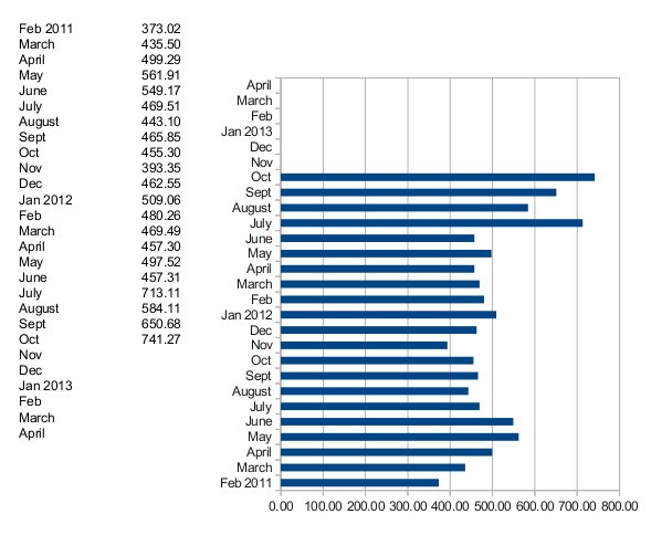
I notice that when I create a listing of months and money going
March 100.00
April 200.00
May 150.00
June 100.00
The graphs always give me the information from bottom to top.
June - - - - -
May - - - - - - -
April - - - - - - - - - -
March - - - - -
I have manually changed the data ranges starting with the last item and
ending with the first, but the column or bar graphs always seem to give
me the same visual of last to first on the chart/graph.
I do not know what is going on with this. I am dealing with a graph
showing month and income is a bar chart, but having the current month on
the left and the oldest month on the right just does not work for others.
Here is the Data info in the "wizard".
Data Range:
$'Royalty Checks'.$A$5:$B$31
Data Series:
column B:
$'Royalty Checks'.$A$5:$A$31
Y-Values $'Royalty Checks'.$A$5:$B$31:
$'Royalty Checks'.$B$5:$B$31
When I do a highlighting for bottom to top or top to bottom, the ranges
and graph always is the same. When I revers the order of the beginning
and end values for the cells, I still get the same order of the graph
visual elements.
I do remember that last year, when I created a chart like this with
3.3.x [late version] or 3.4.x [early version], it did work file. If I
highlighted the top to bottom, it showed the order of the elements
matching top to bottom. I placed the chart/graph next to the columns
[in column C] so the value of the cell is in alignment with the bar on
the chart's graphic. It is used to watch the trend of the income from
that person's monthly royalty checks. Since the earlier spreadsheet was
lost with a computer crash and the backup disk was damaged, I cannot go
back to the old file and just update it.
.
--
For unsubscribe instructions e-mail to: users+***@global.libreoffice.org
Problems? http://www.libreoffice.org/get-help/mailing-lists/how-to-unsubscribe/
Posting guidelines + more: http://wiki.documentfoundation.org/Netiquette
List archive: http://listarchives.libreoffice.org/global/users/
All messages sent to this list will be publicly archived and cannot be deleted